What’s the performance of private equity (“PE”)? A seemingly simple question, but believe me that there is no simple answer. There are too many parameters to look at, such as the performance metric, the time period and the source of the data. In this blog post, I provide an overview of research papers that have investigated this topic and compare their results. I then do my own analysis with Preqin data. It’s gonna be a long post, so let’s get right into it.
Literature review
In the following, I briefly introduce several studies about the performance of PE. This is not a comprehensive summary, but rather a selection of studies I consider important or helpful in shedding light on the question of what returns PE funds deliver to investors. For a more detailed literature review with a very helpful overview table, have a look at Korteweg (2019).
Kaplan and Schoar (2005)
One of the earliest and most influential studies of PE performance, it was some sort of a kickstarter for research on PE. By finding persistence in fund returns - GPs that outperform the industry in one fund are more likely to do so with the next one as well - they also justified, or even established, investors key focus on a GP’s track record. PE fund returns are predictable, in contrast to mutual funds, so betting on the same horses again and again pays off for investors. A GP with a top tercile fund has close to a 50% chance of having a top tercile fund with their next one (see Table IX), both when looking at the PME and IRR.
Kaplan and Schoar (2005) do not find an outperformance of PE over the S&P 500 overall. For their analysis, they use Thomson Venture Economics (TVE) data, which was the prevalent data source back then and also used by the two studies that I introduce next. I don’t want to spill the beans, but let’s just say that data quality really matters…
Phalippou and Gottschalg (2009)
The authors summarize their research question and answer concisely:
The objective of this study is to estimate the performance of private equity funds both net-of-fees and gross-of-fees. We find that the average private equity fund underperforms the S&P 500 Index net-of-fees by about 3% per year and overperforms that index gross-of-fees by 3% per year.
While the language might be prosaic, the content is everything but. How to justify a 3% p.a. underperformance compared to the overall stock market for an asset class that should be deemed at least as risky (highly levered investments in much smaller companies than the S&P 500 constituents) and much more illiquid? And how to reconcile this underperformance with PE’s unprecedented growth in committed capital from USD 5 to USD 300 billion from 1980 to 2004? Did investors keep pouring money into PE despite the poor performance or were they not able to calculate their returns correctly?
To derive at their results, Phalippou and Gottschalg (2009) start with the observation that many older funds, 10 years or more, show no sign of activity: no capital calls or distributions and no changes to the NAV or residual value.1 They interpret this lack of activity as confirmation that the funds are liquidated and write-off their final NAV to zero, in contrast to other studies that treat the residual value as a cash inflow of the same amount.
Writing off the NAVs of the funds fully has a dramatic impact on the performance metrics. However, Stucke (2011) questioned that the inactivity of those funds was really a sign of living dead investments and attributed it to poor data quality instead, which would make the results of Phalippou and Gottschalg (2009) obsolete. Without further ado, let’s discuss Stucke’s findings next.
Stucke (2011)
This study illustrates nicely the complications that arise in PE research from uncertainty about the data quality. Concretely, Stucke looks closer at the Thomson Venture Economics (“TVE”) data, which was until then the predominant data source for researchers. He finds that aggregate performance numbers of TVE are significantly smaller than those from other providers. More importantly, he is able to show that this is the result of about 40 percent of the funds in the TVE data not being updated.
This paper had a profound impact in academia as newer studies pretty much abandoned the TVE data set and focused on other sources instead (see, e.g., R. S. Harris, Jenkinson, and Kaplan (2014) further below). It also brought into question many of the findings of studies that used the TVE data. Finally, it helped explain why far too many GPs could claim to be a top-quartile fund.2
The starting point of Stucke’s investigation are the findings of Phalippou and Gottschalg (2009). In the previous section, I described how those authors took the evidence that the majority of funds had no cash flow activity and no changes in residual values as proof that these funds are “zombie” funds, i.e., funds that do not hold any meaningful residual value, despite reporting it. To deal with this issue, they set the residual value to 0 to calculate the fund’s performance. Stucke finds this curious as
constant NAVs rarely exist (particularly not over several years). Even in the later years of a fund’s lifetime the values of remaining investments get updated regularly. Furthermore, private equity funds without a single cash flow activity for more than three years should equally not exist (there will still be annual management fees or dividends from mature investments). In addition to this, the authors find that average NAVs of these funds equate to over 50% of the amount they invested. Keeping in mind that all of these funds are between 10 and 24 years old and most of them should be liquidated, remaining investments with a constant value as high as 50% of a fund’s size – on average – are surprising.
Stucke subsequently shows that the constant NAVs and missing cash flows are indeed due to the fact that TVE stopped to receive updates from the GPs about the fund performance. To do so, he matches 140 funds from the TVE data with a data set obtained from LPs and finds that these funds showed substantial value creation after TVE stopped to receive updates. Not surprisingly then, results based on the TVE data lead to a downward bias of PE. When Stucke only focuses on fully liquidated funds in the data, which are unaffected by this issue, he finds a meaningful outperformance of U.S. buyout funds compared to the S&P 500.
R. S. Harris, Jenkinson, and Kaplan (2014)
This study, published in one of the most prestigious finance journals, is the first to use data sourced by Burgiss. Why is that such a big deal? Because it is notoriously difficult to obtain high quality PE data. There is typically no obligation by GPs and LPs to report their performance to any external parties. So other data providers, such as Preqin, must on data that is provided to them, either because some LPs are forced to do so - essentially U.S. public pension funds because of the Freedom of Information Act - or because GPs want to. This, of course, creates a few issues: as the pension funds are forced to publish the data, but there is no benefits for them to do so, the data provided is not really well documented. They also do not provide the data in a standardized and granular way. This makes it very difficult to figure out exactly what happens, and it is not uncommon to find different performance results from different pension funds for the very same fund. With data provided by GPs, there is a high risk of selection bias: obviously, GPs only have an interest to report those funds that perform well. In addition, GPs that had to close down because of their bad performance cannot report anymore (hindsight bias). Finally, you might have GPs with such a strong track record and such a high demand of LPs that they do not see any reason to publish their performance. And finally a GP might decide to stop reporting, as seemed to have happened in the case of TVE, with dire consequences as we have seen in the previous sections.
Burgiss does not have these issues as they source the data directly from LPs that use their platform for their internal bookkeeping. As a result, the quality checks when entering the data are rigorous and there is good reason to believe that there is no selection bias: LPs don’t stop reporting on a fund just because it performs poorly. One could still argue that the group of LPs that use Burgiss did not assemble a portfolio that is representative of the whole PE universe. For example, it is likely that the LPs that use Burgiss are larger, more institutionalized LPs that tend to invest in larger funds. However, one would have to argue that such biases in fund selection by the LPs are correlated with the performance of the funds selected. And there is no strong reason to do so.
R. S. Harris, Jenkinson, and Kaplan (2014) continue to show that their sample of U.S. buyout funds outperformed the S&P 500 by roughly 3% p.a., which is a significant premium. Furthermore, this outperformance happened fairly consistently over their time period from 1984 to 2008 (see Table IV in their study). They also use other indices such as the Russell 3000, which is focused more on smaller listed companies that might be a better comparison for PE. This slightly reduces the outperformance but does not get rid of it.
For VC, the picture is more mixed. While VC outperformed markets considerably in the 90s, this trend reversed in the 2000s until 2008. Overall, they find an average outperformance, but a median underperformance over the whole sample. One would assume that the strong performance over the last few years, so after the end of their analysis, for growth companies might have changed the picture a bit - more on this below. Overall, VC’s performance is more cyclical than the buyout one.
In their Table VIII, R. S. Harris, Jenkinson, and Kaplan (2014) compare the PMEs from the Burgiss data set with those from Cambridge Associates (CA), Preqin and Venture Economics. While the latter has a downward bias issue as uncovered by Stucke (2011), they show that the results with CA and Preqin data are rather similar. This result counters fears that because of the weaker data collection process applied by providers such as CA and Preqin systematic biases impact the conclusions meaningfully. Instead, the results are comparable. My co-author and I found the same when we compared the Preqin data set with two data sets that were sourced directly from the LPs or the GPs.
Phalippou (2014)
This study does pretty much the same as R. S. Harris, Jenkinson, and Kaplan (2014), with two important deviations.
First, it uses data from Preqin. However, to counter any criticism of data quality issues, it shows that the results are comparable to studies such as R. S. Harris, Jenkinson, and Kaplan (2014). This is of course not surprising, as they have made the same argument in their study.
Second, it argues that buyout funds invest in companies that are much smaller than most listed companies, that are value, instead of growth companies, and that use more leverage. As all these factors are known to have led to higher stock returns historically, Phalippou argues that one should use indices that adjust for these factors. Using a small value index essentially gets rid of any outperformance in the data, leveraging the index up based on some high-level assumptions, the mean and median PME falls below 1, indicating an underperformance of PE funds to these indices.
Similar results have been found by studies that looked at deal-level performance. Of course, it is important to bear in mind that the public indices Phalippou had to use to get the PME down had some of the strongest performances in U.S. public equity, which by itself is one of the strongest asset classes. It’s a bit like saying that compared to Michael Jordan, LeBron James is a worse basketball player…that might be true, but it certainly doesn’t mean he is bad at playing basketball.
Honorable mentions
The literature on PE performance has become too vast to fully cover, so this overview cannot cover all studies published on the topic of PE performance. Above, I introduced a few studies in more detail, let’s mention briefly a few more:
- Hooke and Yook (2016) compare 18 larger, well regarded buyout managers with the overall buyout market and find that their returns are slightly above average.
- Sorensen, Wang, and Yang (2014) ask the question if the net performance of PE investments is enough to compensate the investors for the leverage and illiquidity they take on and the management and incentive fees they pay to the GPs. To answer it, they develop a model that incorporate these risk/costs and find that funds must generate substantial alpha to compensate investors for them.
- Korteweg and Sorensen (2017) build upon the work of Kaplan and Schoar (2005) and decompose PE performance into three components: long-term persistence of the GP; spurious persistence that exists due to exposure to the same market conditions of two consecutive funds; persistence due to luck or noise. They find that long-term persistence still exists, although it has declined in the 2000s, relative to the 1990s. Interestingly, the decline in persistence is strongest in the case of VC, while buyout GPs show much stronger persistence.
- Cavagnaro et al. (2019) show that institutional investors’ skill in selecting PE funds is important in determining the returns. As Korteweg and Sorensen (2017) point out, this is a key piece to solve the puzzle as to why GP persistence continues to exist in PE: “Skilled PE firms are scarce, but LPs with the ability to identify these skilled firms can also be scarce.”
- Brown, Gredil, and Kaplan (2019) is one of my favorite studies as it helps me frequently in my job when I’m assessing a GP’s track record. They examine if one can trust the GP’s reported valuations. They should be mark-to-market, but we all know that there is enough wiggle room that one could be too optimistic or cautious, depending on the agenda of the GP. They find that GPs that struggle to raise a new fund inflate their valuations and in consequence their track record. Strong GPs, on the other hand, do not require such tricks and have no incentive to overpromise to their investors, which is why they typically value their assets conservatively. Finally, their results indicate that investors look through the valuation manipulation of poor GPs as it does not help them in raising new funds. With regards to the question about PE performance, this is a very important study as it shows that residual values cannot be taken at face value and one has to be careful to draw conclusions from funds that are not fully realized. After all, this was the premise of Phalippou and Gottschalg (2009), they just took an extreme approach (writing the residual value off).3
Summary
To summarize: Earlier studies found no outperformance, or even an underperformance, of PE compared to the broader stock market. These results, however, were due to a bias in the data used. Using better data, often reported directly from the investors, newer studies found an outperformanceinstead. A plethora of research linked this outperformance with risks - for example due to illiquidity, leverage, and factor exposure - and costs (fees and carry), arguing that the true alpha, after adjusting for them, is closer to zero or even negative again.
From a practitioner’s perspective, I find that there is often not much interest in explanations as to which factors drive the overall good returns of PE and arguments if they simply compensate investors for risk factors or can be considered true alpha. Alas, one can even argue that Buffett’s returns are simply due to exposure to some risk factors and leverage. How much do Buffett’s investors care?
What is of great interest to practitioners is often a thorough understanding of PE returns, with a focus on metrics that are used in the industry (IRR, multiple / MOIC). Yes, they have shortcomings, but despite these shortcomings they are still widely used. This is the focus of the empirical part of this blog post, where I present the results for different strategies (VC, growth, buyout) and geographies with an up-to-date data set as of February 2022.
Data source and characteristics
Let’s revisit some of topics discussed above with an up-to-date data set from Preqin. This is not the gold standard of data sets available - right now this can be considered to be Burgiss - but it has been shown repeatedly that results from Preqin lead to comparable conclusions as other, higher quality data sets (see, e.g., R. S. Harris, Jenkinson, and Kaplan (2014), Phalippou (2014) or Diller and Jäckel (2015)). I will only focus on funds for which Preqin provides cash flow data, which is only a subset of the funds that Preqin tracks and of the overall PE fund universe. I obtained the data in February 2022.
In this section, I will introduce the data set in more detail. As we have seen above, the quality of the data has a large impact on the results, and hence, it is important to get comfortable with the data set and understand its characteristics. However, readers interested in PE performance can skip this section.
Number of funds over time and by strategy
Before we look into the performance, let’s first have a look at the number and size of funds for which Preqin has cash flows. This gives us a better understanding of what share of the PE market the data set covers.
Looking at the numbers of funds shows that Preqin only has a few funds per vintage year until the mid-90s, while they increase substantially over time thereafter. While there is a persistent long-term growth for buyout and growth funds, there is quite a bit of volatility across vintage years, in line with overall market cycles. For example, there are 72 buyout funds with a vintage year of 2007 in the sample, while there are only 32 for 2009. Interestingly, it took two decades to overtake 2000 as the all-time record year for VC funds, showing how keen investors were to invest in young companies around the dot-com bubble.
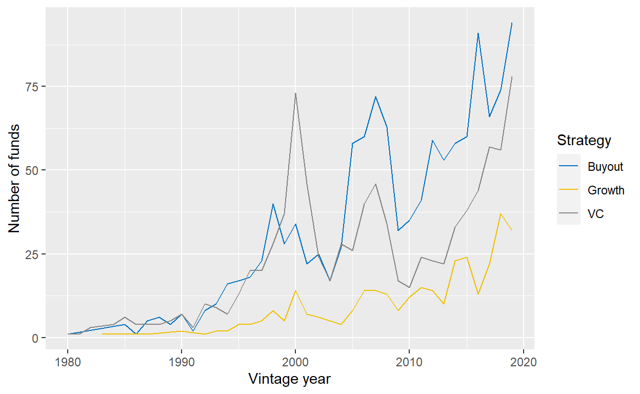
Figure 1: Number of funds per vintage year with full cash flow data from Preqin, split by the strategy of fund.
Number of funds by region
Another interesting question is how many funds there are per geography. The table below gives the answer. Not surprisingly, North America is by far the largest contributor, which is also in line with current fundraising data that shows North America’s leading position. Europe is the second-largest market, followed by Asia. The other markets are very small in comparison. Going forward, I will therefore only report statistics for North America and Europe and pool the rest under “Rest of the World.”
| Geography | Buyout | Growth | VC | Total |
|---|---|---|---|---|
| Africa | 4 | 7 | 0 | 11 |
| Americas | 24 | 7 | 2 | 33 |
| Asia | 56 | 76 | 45 | 177 |
| Australasia | 22 | 2 | 7 | 31 |
| Diversified Multi-Regional | 2 | 8 | 2 | 12 |
| Europe | 287 | 47 | 82 | 416 |
| Middle East & Israel | 4 | 0 | 20 | 24 |
| North America | 832 | 179 | 769 | 1780 |
| Global | 1231 | 326 | 927 | 2484 |
Comparison with other data sets
At the risk of repeating myself: Preqin, as any PE data set, does not cover the whole universe of PE funds. As such, one should be careful from drawing conclusions about PE in general when looking at one particular data set. One important question to ask is therefore if the data set at hand is comparable to other data sets. I argued above that Preqin leads to comparable results when looking at the performance of PE. Let’s look now if the Preqin data set also has a coverage that is similar to other sources. To do so, the plot below compares the number of funds in the Preqin data set with various other sources, as reported by R. S. Harris, Jenkinson, and Kaplan (2014) in their Table I. As they look at vintages from 1984 to 2008 and only North American funds, I limit the sample accordingly. Also, they only report numbers for buyout and VC funds. As I do not know how they classify growth funds, I ignore them.
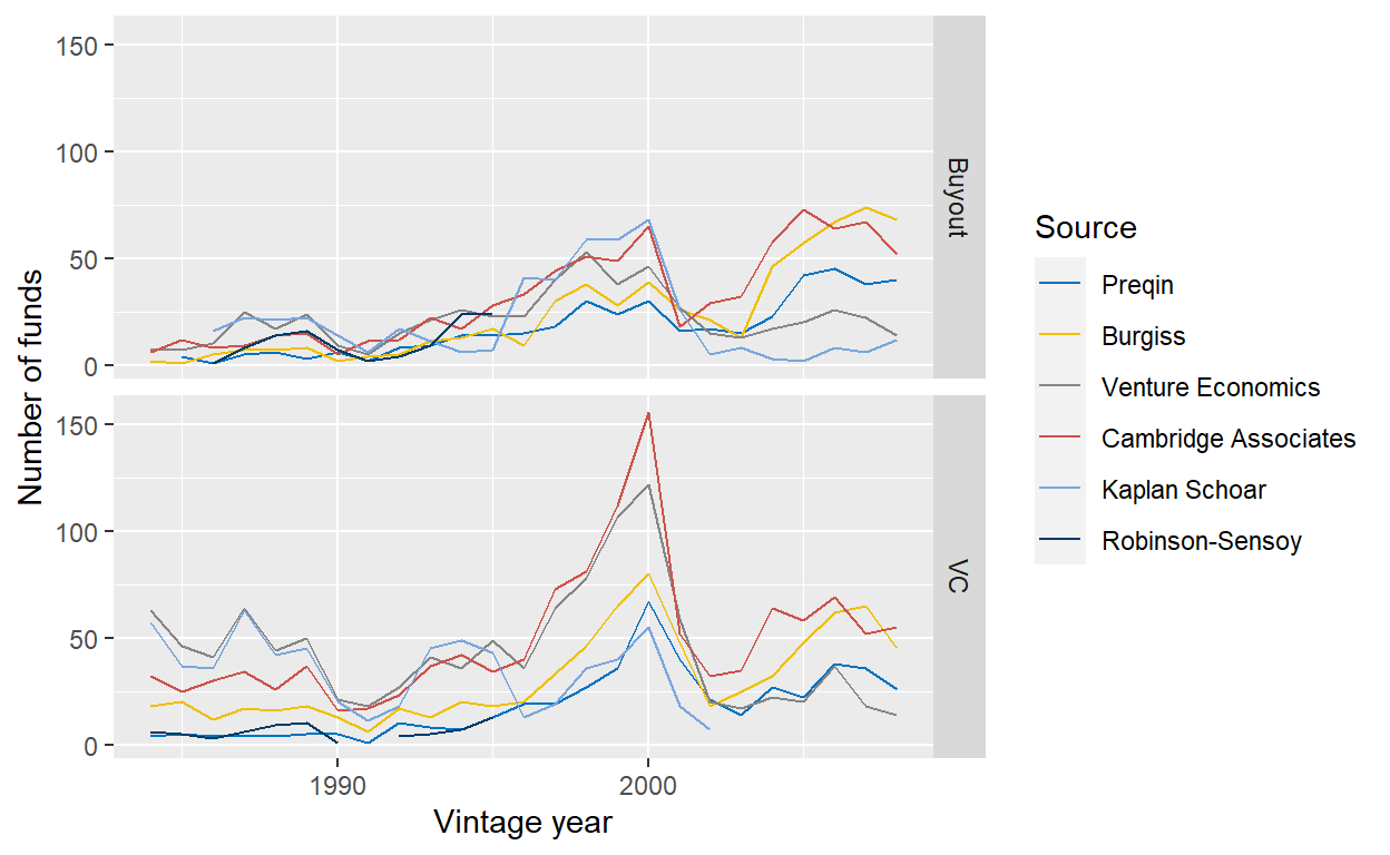
Figure 2: Comparison of number of funds from North American funds in the Preqin data with other data sets, as provided by Harris et al. (2014) (see Table I).
With regards to buyout funds, Preqin (dark blue) is comparable with Burgiss (yellow) and other data providers, although being on the lower end of funds covered. For VC, the coverage of Preqin is substantially lower than others, in particular until around 2000. Most notably Cambridge Associates and Venture Economics cover many more funds. However, Preqin’s coverage seemed to have increased in the 2000s. With regards to the coverage over time, the patterns are comparable across the main data providers: strong increase until 2000, sharp decrease during the dot-com bubble crash, steady increase thereafter. This gives me comfort that these data sets cover the overall PE market cycle, rather than some idiosyncratic data collection trends.4
Coverage in relation to PE universe
While Preqin is comparable to other data providers in terms of coverage, especially after 2000, the question remains how good the coverage is. Do those data providers cover most of the PE universe or only a fraction of it? There will not be a perfect answer to this question as no one knows for sure how large the PE universe really is. However, we can look at data that estimates the size of the overall PE market and compare it with the size by the funds covered by Preqin.
In the table below, I compare fundraising numbers for the overall private markets, as reported by McKinsey (2021) (see Exhibit 2), with the aggregate size of the funds in Preqin that have cash flow data. As the McKinsey study only reports fundraising numbers over time for private markets, not PE, I estimate the ratio by multiplying the historic numbers with the 2020 ratio shown in Exhibit 1 of their report (59%, USD 857.8bn for private markets vs. USD 502.9bn for PE). This is obviously a rather crude measure, but it should give use a ballpark idea of how good the coverage of Preqin is.
| Vintage year | Private Markets Fundraising | PE Fundraising (estimated) | Total size of Preqin funds with CF data | Coverage |
|---|---|---|---|---|
| 2010 | 311 | 182 | 45 | 25% |
| 2011 | 378 | 222 | 103 | 46% |
| 2012 | 434 | 254 | 115 | 45% |
| 2013 | 593 | 348 | 94 | 27% |
| 2014 | 670 | 393 | 171 | 44% |
| 2015 | 733 | 430 | 137 | 32% |
| 2016 | 846 | 496 | 211 | 43% |
| 2017 | 979 | 574 | 171 | 30% |
| 2018 | 1040 | 610 | 288 | 47% |
| 2019 | 1091 | 640 | 304 | 48% |
The results are rather comforting as Preqin has on average a coverage of 39% over the last decade. They can’t cover the full universe, but quite a big chunk of it! In the following, I will make the implicit assumptions that all results I find from the Preqin data set apply to the overall PE universe. Of course, there is always the risk that I report patterns that are due to the specific biases of the Preqin data set and do not apply to the PE universe. However, it’s a risk I’m willing to take. It’s a blog after all, not a PhD thesis…
Size of funds
I apologize for the long table below, I know it’s dense, but I think also insightful. The table shows, for each strategy and vintage year, three statistics: the number of funds, the average fund size, and the aggregate fund size, which is the product of the first two.
|
Buyout
|
Growth
|
VC
|
|||||||
|---|---|---|---|---|---|---|---|---|---|
|
Vintage
|
Nr. funds
|
Avg. size (in USDm)
|
Agg. size (in USDbn)
|
Nr. funds
|
Avg. size (in USDm)
|
Agg. size (in USDbn)
|
Nr. funds
|
Avg. size (in USDm)
|
Agg. size (in USDbn)
|
| 1990 | 7 | 425.5 | 2.6 | 2 | 953.0 | 1.9 | 7 | 111.4 | 0.8 |
| 1991 | 2 | 121.0 | 0.2 | 3 | 87.4 | 0.2 | |||
| 1992 | 8 | 280.8 | 1.7 | 1 | 184.0 | 0.2 | 10 | 132.6 | 1.2 |
| 1993 | 10 | 322.6 | 2.9 | 2 | 164.5 | 0.3 | 9 | 105.6 | 1.0 |
| 1994 | 16 | 493.1 | 7.9 | 2 | 263.1 | 0.5 | 7 | 113.7 | 0.7 |
| 1995 | 17 | 661.6 | 11.2 | 4 | 191.8 | 0.8 | 13 | 102.6 | 1.3 |
| 1996 | 18 | 399.9 | 7.2 | 4 | 279.5 | 1.1 | 20 | 198.7 | 4.0 |
| 1997 | 23 | 786.6 | 18.1 | 5 | 440.4 | 2.2 | 20 | 136.9 | 2.6 |
| 1998 | 40 | 978.7 | 39.1 | 8 | 1,063.9 | 8.5 | 28 | 246.4 | 6.9 |
| 1999 | 28 | 1,013.7 | 28.4 | 5 | 574.8 | 2.9 | 37 | 373.2 | 13.4 |
| 2000 | 34 | 1,579.3 | 53.7 | 14 | 999.4 | 14.0 | 73 | 426.5 | 31.1 |
| 2001 | 22 | 1,413.3 | 31.1 | 7 | 1,185.8 | 8.3 | 46 | 452.6 | 20.4 |
| 2002 | 25 | 1,053.5 | 26.3 | 6 | 156.8 | 0.9 | 24 | 260.5 | 6.3 |
| 2003 | 17 | 1,848.3 | 31.4 | 17 | 253.4 | 4.3 | |||
| 2004 | 27 | 1,266.0 | 34.2 | 4 | 931.8 | 3.7 | 28 | 225.7 | 6.3 |
| 2005 | 58 | 1,751.7 | 101.6 | 8 | 1,385.6 | 11.1 | 26 | 278.1 | 7.2 |
| 2006 | 60 | 3,015.5 | 180.9 | 14 | 1,178.0 | 16.5 | 40 | 489.5 | 19.6 |
| 2007 | 72 | 2,706.9 | 194.9 | 14 | 1,814.0 | 25.4 | 46 | 276.5 | 12.7 |
| 2008 | 63 | 2,608.1 | 164.3 | 13 | 1,436.4 | 18.7 | 34 | 403.2 | 13.3 |
| 2009 | 32 | 1,510.8 | 48.3 | 8 | 833.5 | 6.7 | 17 | 304.0 | 4.3 |
| 2010 | 35 | 871.3 | 30.5 | 12 | 763.5 | 9.2 | 15 | 357.3 | 5.0 |
| 2011 | 41 | 2,115.7 | 86.7 | 15 | 635.2 | 9.5 | 24 | 299.4 | 6.9 |
| 2012 | 59 | 1,483.1 | 87.5 | 14 | 1,328.0 | 18.6 | 23 | 387.0 | 8.5 |
| 2013 | 53 | 1,423.7 | 75.5 | 10 | 1,068.5 | 10.7 | 22 | 358.2 | 7.5 |
| 2014 | 58 | 2,484.6 | 141.6 | 23 | 909.5 | 20.9 | 33 | 274.3 | 8.5 |
| 2015 | 60 | 1,586.6 | 95.2 | 24 | 1,214.2 | 27.9 | 38 | 385.1 | 13.5 |
| 2016 | 91 | 2,080.8 | 185.2 | 13 | 994.9 | 11.9 | 44 | 353.5 | 14.1 |
| 2017 | 66 | 2,113.7 | 139.5 | 22 | 638.8 | 13.4 | 57 | 353.0 | 18.0 |
| 2018 | 74 | 3,060.0 | 220.3 | 37 | 1,357.5 | 50.2 | 56 | 354.2 | 17.7 |
| 2019 | 94 | 2,668.7 | 237.5 | 32 | 1,142.2 | 35.4 | 78 | 456.8 | 31.5 |
While buyout funds only make up 50% with regards to their numbers, they are responsible for 79% of the aggregate due to their larger size than VC and growth funds. Growth funds have raised a bit more capital overall in the sample than VC (USD 331bn vs. 289bn), despite much lower number of funds (see chart above). These funds can be quite sizable, too, with brands like Warburg Pincus and Insight Partners that raise multi-billion funds.
With regards to fund size growth over the years, VC had the steadiest and slowest out of all of them: VCs were raising on average a few hundred million in the 90s, and they continue to do so in the late 2010s. As VCs are backing founders and their visions and often not much more, the capital needs per investment simply don’t change much over the decades. That also explains why the strong VCs can be so access restricted: getting more capital is not their concern, it’s about finding the right teams to back. For buyout funds, the story is different: they can always write bigger checks or do larger M&As, etc. That’s why the fund sizes have grown much more over the years. However, fundraising is also more cyclical. For example, while a lot of buyout GPs collected money for large funds in 2006 and 2007, both the number and the size of funds plummeted in 2009/10. For VC funds, only the number of funds declined, while the fund sizes remained stable. My best guess is that some VCs with weaker track records were unable to raise follow-on funds, while the strong brands had a long line of LPs who were waiting to get it so that they could replace those LPs that suffered from the GFC.
Another interesting trend is that for buyout funds, both the fund size and the number of funds increased close to three times from 2010 to 2019. In contrast, the number of VC funds increased by a factor of 5.2x in the same period, while the fund size only increased by 28%. When things go well, LPs deploy more capital into the established buyout managers, while they give money to newer VCs as the capacity to the established brands is limited.
So far, I looked at average fund sizes per strategy, but what about the dispersion? The table below gives the answer.
| Strategy | 5% | 10% | 25% | 50% | Mean | 75% | 90% | 95% |
|---|---|---|---|---|---|---|---|---|
| VC | 28 | 54 | 115 | 225 | 337 | 425 | 677 | 909 |
| Buyout | 121 | 199 | 360 | 821 | 1,933 | 2,259 | 4,859 | 7,270 |
| Growth | 45 | 79 | 199 | 497 | 1,094 | 1,038 | 2,100 | 3,586 |
For all three strategies, there is a large spread between the 5th and the 95th percentile. Not surprisingly, the spread is much larger for buyout and growth funds (factor 60x and 79x) than for VC (factor 33x). Again, the most likely explanation is that successful VCs must limit their fund sizes much more, as capital needs per investment are not that dependent on the market cycle and they don’t want to dilute their returns by investing in more start-ups. Instead, they want to focus on those with the biggest chance of succeeding.
As a result, the distribution is more right-skewed for buyout and growth with a much larger mean than median. Yes, the average buyout fund size is USD 1,933 million, but the average buyout fund only has a size of USD 821 million.
Performance of PE
Total-Value to Paid-In (“TVPI”)
By vintage year
The table below shows the mean, median, and weighted mean TVPIs, or multiples, by strategy and vintage year from 1990 to 2019. It also shows the ratio of active to all funds for each group. It’s important to keep in mind that for the younger vintage years, many funds are still unrealized and TVPIs are expected to increase further. Hence, this is not the final result, just a snapshot. Hopefully, the 2019 vintage doesn’t end up slightly above 1x!
|
Buyout
|
Growth
|
VC
|
||||||||||
|---|---|---|---|---|---|---|---|---|---|---|---|---|
|
Vintage
|
Ratio active funds
|
Mean TVPI
|
Median TVPI
|
Mean TVPI (weighted by size)
|
Ratio active funds
|
Mean TVPI
|
Median TVPI
|
Mean TVPI (weighted by size)
|
Ratio active funds
|
Mean TVPI
|
Median TVPI
|
Mean TVPI (weighted by size)
|
| 1990 | 0% | 2.05 | 2.36 | 1.98 | 0% | 2.27 | 2.27 | 2.38 | 0% | 2.15 | 2.22 | 2.15 |
| 1991 | 0% | 2.21 | 2.21 | 2.55 | 0% | 2.11 | 2.28 | 2.83 | ||||
| 1992 | 0% | 1.59 | 1.19 | 2.15 | 0% | 2.82 | 2.82 | 2.82 | 0% | 3.61 | 3.09 | 3.54 |
| 1993 | 0% | 2.45 | 2.19 | 2.60 | 0% | 2.30 | 2.30 | 2.22 | 0% | 3.59 | 3.11 | 4.03 |
| 1994 | 0% | 2.07 | 2.05 | 2.15 | 0% | 2.02 | 2.02 | 2.24 | 0% | 3.77 | 2.91 | 3.89 |
| 1995 | 0% | 1.48 | 1.35 | 1.63 | 0% | 1.92 | 2.35 | 2.38 | 0% | 3.75 | 2.13 | 4.32 |
| 1996 | 0% | 1.52 | 1.70 | 1.61 | 0% | 1.47 | 1.26 | 1.36 | 5% | 3.21 | 1.58 | 3.52 |
| 1997 | 4% | 1.41 | 1.46 | 1.61 | 0% | 1.57 | 1.47 | 1.48 | 0% | 1.87 | 1.35 | 1.98 |
| 1998 | 5% | 1.45 | 1.36 | 1.44 | 0% | 1.38 | 1.40 | 1.58 | 18% | 1.65 | 0.97 | 1.66 |
| 1999 | 11% | 1.57 | 1.56 | 1.60 | 0% | 1.82 | 1.35 | 1.40 | 16% | 0.77 | 0.65 | 0.75 |
| 2000 | 15% | 1.94 | 2.00 | 1.99 | 0% | 1.49 | 1.52 | 1.51 | 18% | 0.92 | 0.94 | 0.96 |
| 2001 | 32% | 1.86 | 1.83 | 2.00 | 14% | 2.12 | 2.34 | 2.24 | 39% | 1.20 | 1.04 | 1.27 |
| 2002 | 12% | 1.81 | 1.91 | 1.98 | 33% | 1.30 | 1.42 | 1.36 | 33% | 0.96 | 0.94 | 1.13 |
| 2003 | 35% | 1.94 | 1.77 | 2.03 | 41% | 1.20 | 1.23 | 1.17 | ||||
| 2004 | 22% | 1.71 | 1.72 | 1.78 | 25% | 1.57 | 1.73 | 1.78 | 39% | 1.40 | 0.77 | 1.23 |
| 2005 | 52% | 1.59 | 1.54 | 1.70 | 38% | 2.24 | 1.99 | 1.92 | 85% | 1.71 | 1.40 | 1.82 |
| 2006 | 57% | 1.54 | 1.53 | 1.49 | 57% | 2.34 | 1.75 | 1.35 | 70% | 1.31 | 1.25 | 1.35 |
| 2007 | 82% | 1.55 | 1.51 | 1.55 | 57% | 1.70 | 1.57 | 1.70 | 91% | 2.16 | 1.86 | 2.19 |
| 2008 | 79% | 1.74 | 1.68 | 1.72 | 77% | 1.62 | 1.22 | 1.22 | 74% | 2.08 | 1.41 | 1.62 |
| 2009 | 94% | 1.83 | 1.74 | 1.88 | 88% | 1.57 | 1.25 | 1.70 | 94% | 1.95 | 1.70 | 1.86 |
| 2010 | 74% | 1.84 | 1.99 | 1.89 | 100% | 2.02 | 1.57 | 1.82 | 93% | 1.94 | 1.84 | 1.94 |
| 2011 | 100% | 1.67 | 1.69 | 1.90 | 87% | 2.19 | 1.91 | 2.29 | 96% | 3.26 | 2.44 | 2.97 |
| 2012 | 92% | 1.84 | 1.86 | 1.86 | 93% | 1.63 | 1.69 | 1.61 | 100% | 3.20 | 2.08 | 3.20 |
| 2013 | 96% | 1.78 | 1.73 | 1.75 | 80% | 1.62 | 1.48 | 1.75 | 100% | 2.16 | 1.89 | 2.21 |
| 2014 | 100% | 1.99 | 1.68 | 1.91 | 100% | 1.84 | 1.60 | 1.79 | 97% | 2.61 | 2.27 | 2.85 |
| 2015 | 100% | 1.70 | 1.53 | 1.72 | 100% | 1.69 | 1.56 | 1.77 | 100% | 1.98 | 1.72 | 1.97 |
| 2016 | 99% | 1.53 | 1.43 | 1.56 | 100% | 1.44 | 1.46 | 1.80 | 100% | 2.08 | 1.80 | 1.94 |
| 2017 | 100% | 1.54 | 1.48 | 1.70 | 100% | 1.51 | 1.40 | 1.73 | 100% | 1.69 | 1.44 | 1.68 |
| 2018 | 100% | 1.25 | 1.21 | 1.32 | 100% | 1.39 | 1.30 | 1.58 | 100% | 1.57 | 1.34 | 1.60 |
| 2019 | 100% | 1.22 | 1.11 | 1.26 | 100% | 1.18 | 1.04 | 1.25 | 100% | 1.33 | 1.18 | 1.35 |
There is a lot to look at in this table, so let’s get to it. First, let’s stay with the ratio of active funds. Obviously, it’s increasing over time: most funds that started in the 90s are now fully realized, while almost none is from the last decade. Hence, the most interesting decade is the one from 2000 to 2010. While almost all funds have a ten-year term, almost none of them is realized within it. Even the majority of pre-GFC funds with vintages of 2006/7 are still active in 2021/22! This resonates well with an article I recently wrote together with a colleague in PGIM’s Best Ideas series where we show that a lot of the value of a PE fund is still unrealized after 10 years.
The difference across the strategies are also noteworthy: buyout and growth funds are fully liquidated earlier than VC funds. For example, in 14 out of 19 years from 1996 to 2015, the ratio of active VC funds is higher than for buyout funds.
Turning the attention to the TVPIs, one finds that the volatility over time is rather low for buyout funds: looking at vintages 2015 or older, where most of the value creation has already happened, a typical buyout fund’s TVPI lies between 1.19x and 2.36x for each vintage year. In most years, the TVPIs are in a much smaller corridor from 1.4x to 2x. The pattern for growth funds is similar. This is a great result for investors: even if you picked mediocre buyout and growth funds each year, they all made money. This is not true for VC funds, where there are several vintage years (1998, 1999, 2000, 2002, 2004) where the median fund had a TVPI below 1x. On the plus side, returns can be much higher in good years as well, as is shown by the fact that VC is the only strategy where the median TVPI is above 3x for some vintage years (1992, 1993).
In 70% of observations, the mean TVPI is larger than the median. This is no coincidence, but the result of the right-skewed return distribution of PE funds. Look at the TVPI of all funds in the sample below: while most TVPIs lie between 0x to 2.5x, there are some outlier funds that perform substantially better. These exceptionally well-performing funds that return a multiple of the invested capital push up the average, while they have no meaningful impact on the median. In contrast, even the worst performing fund can only end up at 0x. This asymmetry explains the higher averages than medians.
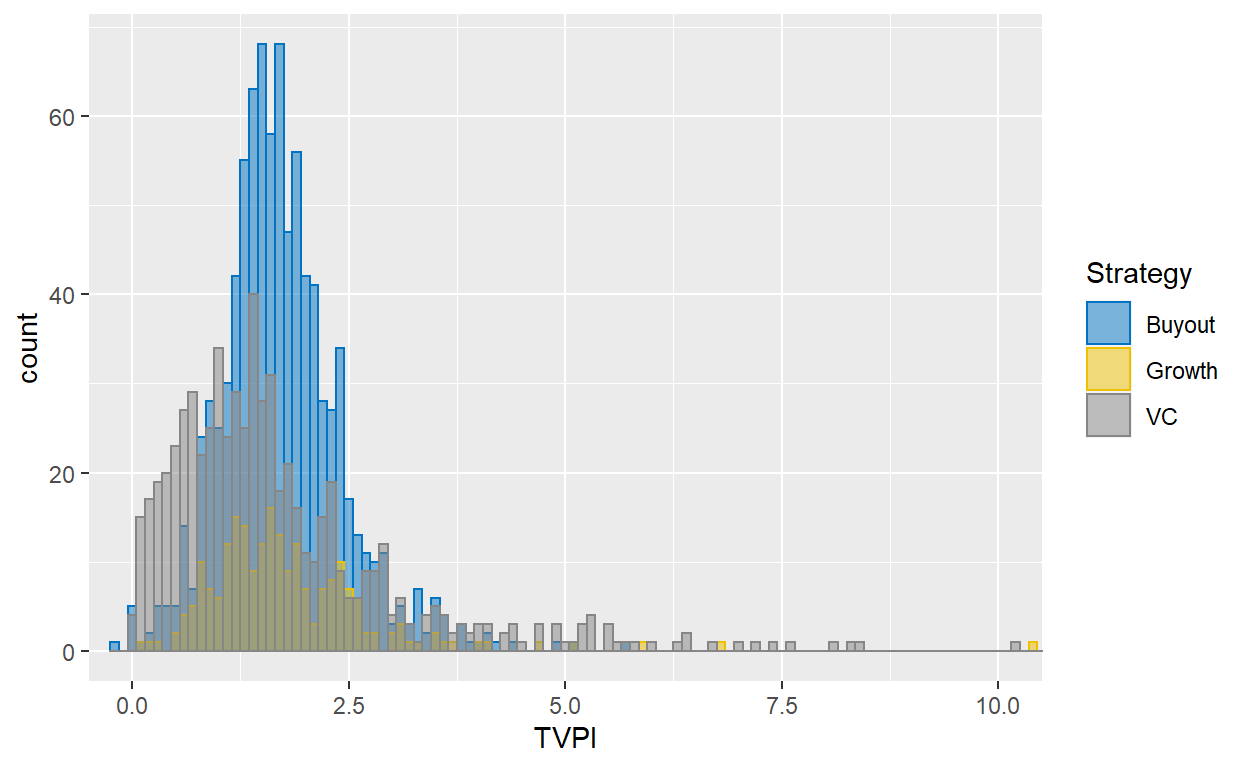
Figure 3: Histogram of PE fund TVPIs from 1990 to 2015. TVPIs over 10x not shown. Data from Preqin.
The table below shows different percentiles and the mean. It has the same message as the histogram, but sometimes it’s nice to see the numbers.
| Strategy | 5% | 10% | 25% | 50% | Mean | 75% | 90% | 95% |
|---|---|---|---|---|---|---|---|---|
| Growth | 0.69 | 0.84 | 1.19 | 1.61 | 1.80 | 2.22 | 2.65 | 3.29 |
| Buyout | 0.74 | 0.93 | 1.31 | 1.66 | 1.72 | 2.07 | 2.54 | 2.93 |
| VC | 0.22 | 0.42 | 0.79 | 1.40 | 1.87 | 2.20 | 3.49 | 5.07 |
Interestingly, VC has both the highest mean and lowest median TVPI. If you are investing in VC, you really want to make sure you get into those outlier funds, either by strong selection skills or by broadly diversifying.
Let’s also compare the multiples with the ones reported by R. S. Harris, Jenkinson, and Kaplan (2014). I focus on vintages from 1990 to 2002 as many of their funds thereafter were mostly unrealized. I also limit my data set to only North American funds, as R. S. Harris, Jenkinson, and Kaplan (2014) focused on this region as well. Overall, the results are similar. The only exception is the average TVPIs for VC funds, which are much higher for some vintage years in the 1990s. However, these vintage years had a low number of funds overall and as I have explained above, the mean is rather sensitive to positive outliers. Their sample must have a few more of those exceptional VC funds included. Overall, the comparison gives me comfort that both samples lead to similar conclusions.
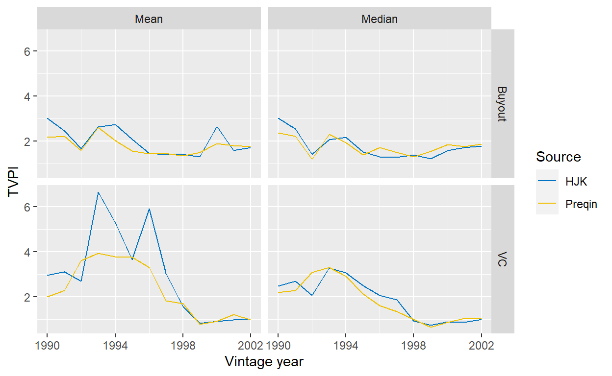
Figure 4: Comparison of performance from North American funds in the Preqin data set compared with Harris et al. (2014) (see Table II).
By region
Are there meaningful differences across regions? The table below gives the answer by showing the mean, median, and weighted mean for different regions for funds with vintage years 1990 to 2015. Starting with buyout funds, the performance of North American and European funds is similar, with a slight advantage of the former. Outside those regions though, the performance has been much lower.
North American growth funds have been stronger than those in Europe and Rest of the World.
Finally, the average of North American VC funds is higher than the average of their peers over the Atlantic, while the median is lower. It seems there have been some really strong VC funds in North America that drove the mean upwards. Interestingly, VC funds outside those two regions had by far the highest weighted mean, but the sample size is small.
| Geography | Nr. of funds | Mean | Median | Weighted mean |
|---|---|---|---|---|
| Buyout | ||||
| Europe | 204 | 1.68 | 1.62 | 1.72 |
| North America | 606 | 1.78 | 1.69 | 1.78 |
| Rest of World | 75 | 1.40 | 1.41 | 1.42 |
| Growth | ||||
| Europe | 29 | 1.73 | 1.60 | 1.73 |
| North America | 126 | 1.82 | 1.73 | 1.71 |
| Rest of World | 64 | 1.80 | 1.45 | 1.63 |
| VC | ||||
| Europe | 50 | 1.78 | 1.56 | 1.69 |
| North America | 571 | 1.89 | 1.39 | 1.70 |
| Rest of World | 39 | 1.77 | 1.35 | 2.13 |
Overall, North American PE funds had a stronger performance than their international peers.
One issue with the above table is that differences in performance could simply be due to different weights of vintage years in the sample: it is fair to assume that the share of North American funds was larger at the beginning of the sample and declined over the years, when PE became more and more popular in other regions. North America might then simply have stronger performance overall as they are overweighted to some early vintages with very strong performance. Hence, let’s plot the TVPIs over time for the regions and strategies.
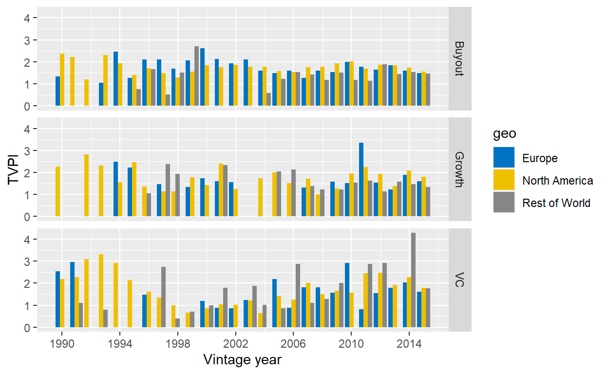
Figure 5: Median TVPIs from 1990 to 2015 for different regions. Data from Preqin.
For buyout and growth, the chart pretty much confirms the above: North American and European buyout funds are comparable, while other buyout funds have weaker performance. North American growth funds are slightly better, but there are also some early vintages where only North America had growth funds in the sample and these vintages were very strong, implying that the difference might partially be driven by timing effects. For VC funds, I do not really see a stronger performance of North American funds overall. In some vintages, they are ahead, in others, European VC funds are. Overall, the patterns found for the whole sample also hold when looking at the performance over vintage years.
However, the chart also shows that there are vintage years in the sample where there are only North American funds, especially in the early years. Hence, one has to be a bit careful to compare different regions as the sample construction changes fundamentally over time.
Internal Rate of Return (“IRR”)
Let’s look at the IRR next, again split by vintage year in the table below. Not surprisingly, the patterns are similar to the TVPI table above: vintage years with strong TVPIs tend to have strong IRRs and buyout and growth funds show less volatility than VC funds. The attentive reader might notice that the ratio of active funds is slightly different between the two samples, which is surprising as the sample universe is the same. The reason is that the IRR sometimes cannot be calculated for a fund as it is not uniquely defined, in which case this fund falls out of the sample. This is for example one explanation why the 1992 buyout cohort has a negative IRR for all statistics and a postive TVPI. There are only 8 buyout funds for this vintage year and one particularly strong one does not have an IRR and is therefore excluded. This pushes the IRRs for the cohort down.
|
Buyout
|
Growth
|
VC
|
||||||||||
|---|---|---|---|---|---|---|---|---|---|---|---|---|
|
Vintage
|
Ratio active funds
|
Mean IRR
|
Median IRR
|
Mean IRR (weighted by size)
|
Ratio active funds
|
Mean IRR
|
Median IRR
|
Mean IRR (weighted by size)
|
Ratio active funds
|
Mean IRR
|
Median IRR
|
Mean IRR (weighted by size)
|
| 1990 | 0% | 10.50 | 7.12 | 11.75 | 0% | 16.58 | 16.58 | 15.13 | 0% | 17.01 | 13.55 | 17.66 |
| 1991 | 0% | 34.05 | 34.05 | 34.05 | 0% | 15.61 | 14.39 | 27.73 | ||||
| 1992 | 0% | -2.08 | -0.67 | -3.95 | 0% | 26.43 | 26.43 | 26.43 | 0% | 35.31 | 34.84 | 43.31 |
| 1993 | 0% | 28.09 | 20.73 | 30.34 | 0% | 17.41 | 17.41 | 17.02 | 0% | 36.86 | 32.84 | 43.06 |
| 1994 | 0% | 20.51 | 18.47 | 22.43 | 0% | 15.55 | 15.55 | 18.40 | 0% | 32.87 | 20.75 | 31.50 |
| 1995 | 0% | 10.24 | 8.03 | 11.24 | 0% | 13.73 | 21.04 | 22.41 | 0% | 46.68 | 33.74 | 56.52 |
| 1996 | 0% | 10.03 | 11.64 | 13.40 | 0% | 7.40 | 6.63 | 6.49 | 5% | 34.25 | 11.35 | 39.67 |
| 1997 | 4% | 7.11 | 7.47 | 10.12 | 0% | 10.97 | 7.63 | 11.59 | 0% | 30.22 | 9.66 | 31.33 |
| 1998 | 6% | 5.65 | 5.62 | 5.85 | 0% | 8.88 | 10.34 | 9.61 | 19% | 21.71 | 0.70 | 23.98 |
| 1999 | 12% | 7.78 | 10.57 | 8.91 | 0% | 6.24 | 7.60 | 5.31 | 17% | -3.09 | -6.59 | -5.86 |
| 2000 | 17% | 15.52 | 13.41 | 15.85 | 0% | 6.84 | 8.43 | 6.25 | 18% | -4.16 | -1.79 | -2.02 |
| 2001 | 37% | 23.52 | 19.26 | 27.53 | 14% | 18.43 | 16.28 | 18.85 | 41% | 0.77 | 0.69 | 3.01 |
| 2002 | 12% | 19.26 | 18.82 | 25.76 | 33% | 3.78 | 7.69 | 5.95 | 35% | -5.97 | -2.90 | -0.31 |
| 2003 | 38% | 26.39 | 17.63 | 25.14 | 41% | 0.70 | 3.15 | 0.86 | ||||
| 2004 | 22% | 9.22 | 11.70 | 13.57 | 25% | 13.30 | 10.74 | 23.23 | 48% | -2.82 | 1.17 | -0.64 |
| 2005 | 53% | 9.47 | 8.37 | 11.26 | 38% | 11.15 | 12.49 | 10.82 | 85% | -0.09 | 4.52 | 1.45 |
| 2006 | 59% | 7.88 | 8.29 | 6.95 | 57% | 13.60 | 11.51 | 1.85 | 72% | 0.95 | 3.57 | 3.10 |
| 2007 | 84% | 8.96 | 9.14 | 8.82 | 57% | 8.70 | 8.96 | 8.62 | 91% | 11.28 | 12.08 | 12.81 |
| 2008 | 79% | 11.89 | 12.46 | 12.39 | 77% | 5.64 | 4.16 | -1.79 | 76% | 6.13 | 6.81 | 3.05 |
| 2009 | 94% | 15.32 | 14.21 | 16.20 | 88% | 7.61 | 5.31 | 10.02 | 94% | 11.75 | 11.43 | 10.95 |
| 2010 | 74% | 12.57 | 15.84 | 12.25 | 100% | 11.21 | 8.10 | 10.55 | 93% | 11.25 | 11.90 | 12.60 |
| 2011 | 100% | 11.94 | 13.42 | 14.44 | 93% | 18.88 | 19.62 | 16.83 | 100% | 18.13 | 17.63 | 18.11 |
| 2012 | 93% | 15.75 | 17.41 | 17.87 | 93% | 10.58 | 9.74 | 10.67 | 100% | 16.43 | 16.81 | 20.59 |
| 2013 | 96% | 17.50 | 16.05 | 16.87 | 80% | 9.93 | 11.55 | 10.01 | 100% | 16.85 | 13.97 | 21.16 |
| 2014 | 100% | 19.98 | 17.20 | 18.36 | 100% | 16.72 | 17.40 | 14.15 | 97% | 32.13 | 22.35 | 36.10 |
| 2015 | 100% | 19.21 | 17.64 | 20.92 | 100% | 15.78 | 15.49 | 16.10 | 100% | 20.17 | 18.21 | 20.37 |
| 2016 | 99% | 16.62 | 15.77 | 18.96 | 100% | 15.48 | 15.50 | 24.21 | 100% | 26.83 | 27.86 | 26.58 |
| 2017 | 100% | 22.79 | 21.86 | 26.03 | 100% | 25.40 | 20.13 | 35.30 | 100% | 25.50 | 22.04 | 29.15 |
| 2018 | 100% | 14.62 | 15.92 | 25.57 | 100% | 23.94 | 20.27 | 37.98 | 100% | 28.54 | 22.69 | 32.94 |
| 2019 | 100% | 20.84 | 11.77 | 27.08 | 100% | 18.37 | 5.78 | 27.64 | 100% | 33.10 | 20.86 | 36.34 |
Next, let’s look at the distribution of IRRs over the full sample. Comparing this one with the table for TVPIs, there is one crucial difference: average IRRs are considerably higher for buyout funds than for the other two strategies. As the IRR is a performance measure that considers the timing of the cashflows, while the TVPI does not, the culprit for the difference is clear: buyout funds return capital back faster to the investors than growth and VC funds. I will show this in more detail in the DPI section.
| Strategy | 5% | 10% | 25% | 50% | Mean | 75% | 90% | 95% |
|---|---|---|---|---|---|---|---|---|
| Growth | -5.98 | -2.53 | 4.16 | 11.05 | 12.00 | 19.04 | 26.25 | 32.33 |
| Buyout | -5.72 | -1.24 | 6.51 | 12.90 | 13.45 | 20.23 | 28.24 | 35.56 |
| VC | -20.45 | -12.72 | -3.05 | 6.07 | 10.88 | 18.05 | 32.97 | 50.52 |
Finally, I compare the IRRs in my North American sample with the ones shown in R. S. Harris, Jenkinson, and Kaplan (2014). The correlation between the two is very high.
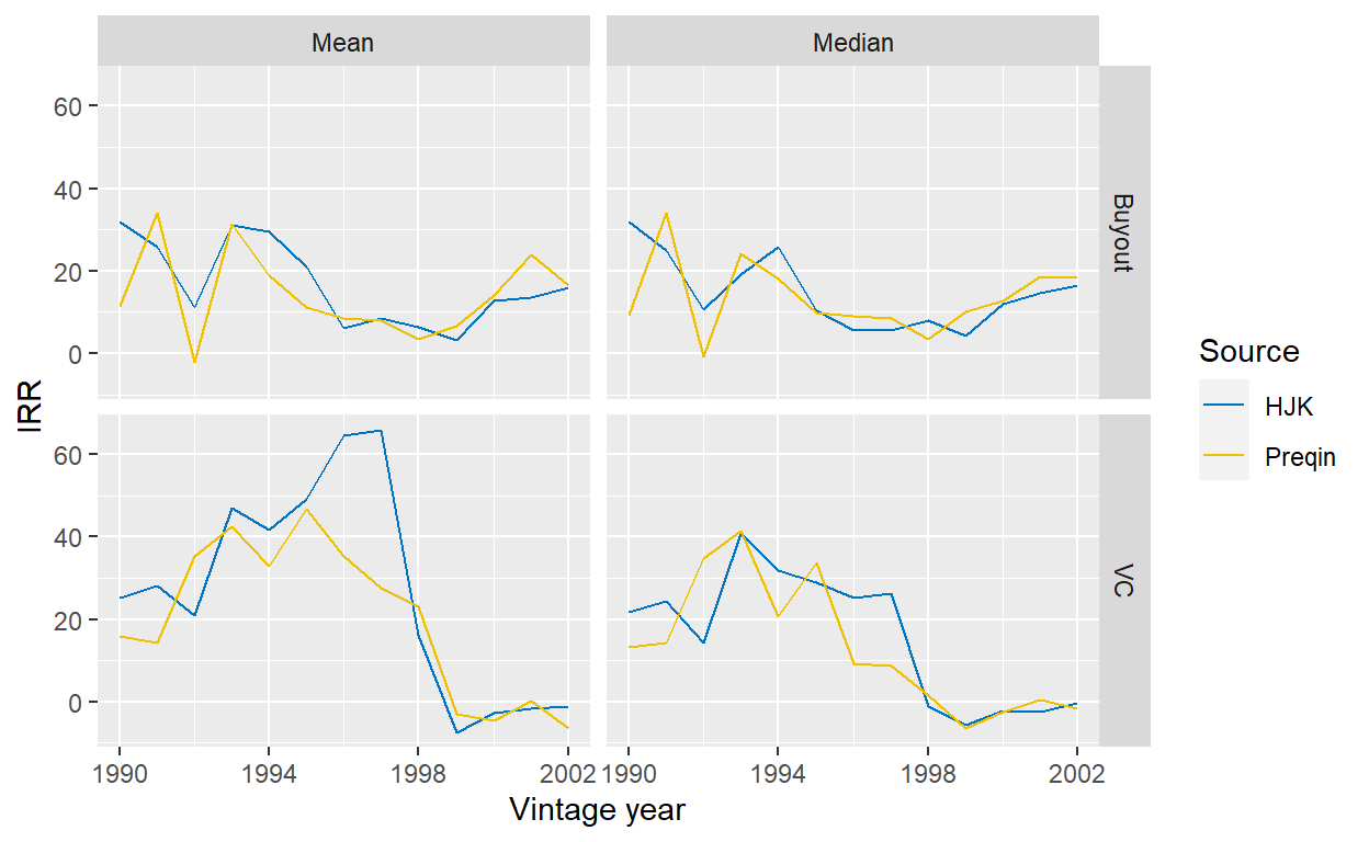
Figure 6: Comparison of IRRs from North American funds in the Preqin data set compared with Harris et al. (2014) (see Table II).
Distributed to Paid-In (“DPI”)
As the previous sections have shown, buyout funds perform better compared to the other strategies when performance is measured with the IRR instead of the TVPI. As the former takes the timing of cash flows into consideration, while the latter does not, the reason must be that buyout funds return money to investors quicker. If we look at the J-curves for the three different strategies, this is exactly what we find. A typical buyout fund, shown as the black line in the middle of the violet area, has a DPI above 1x around 8 years. For a growth fund, it takes a bit longer, while a typical VC fund struggles to make it to 1x within a 15-year window!
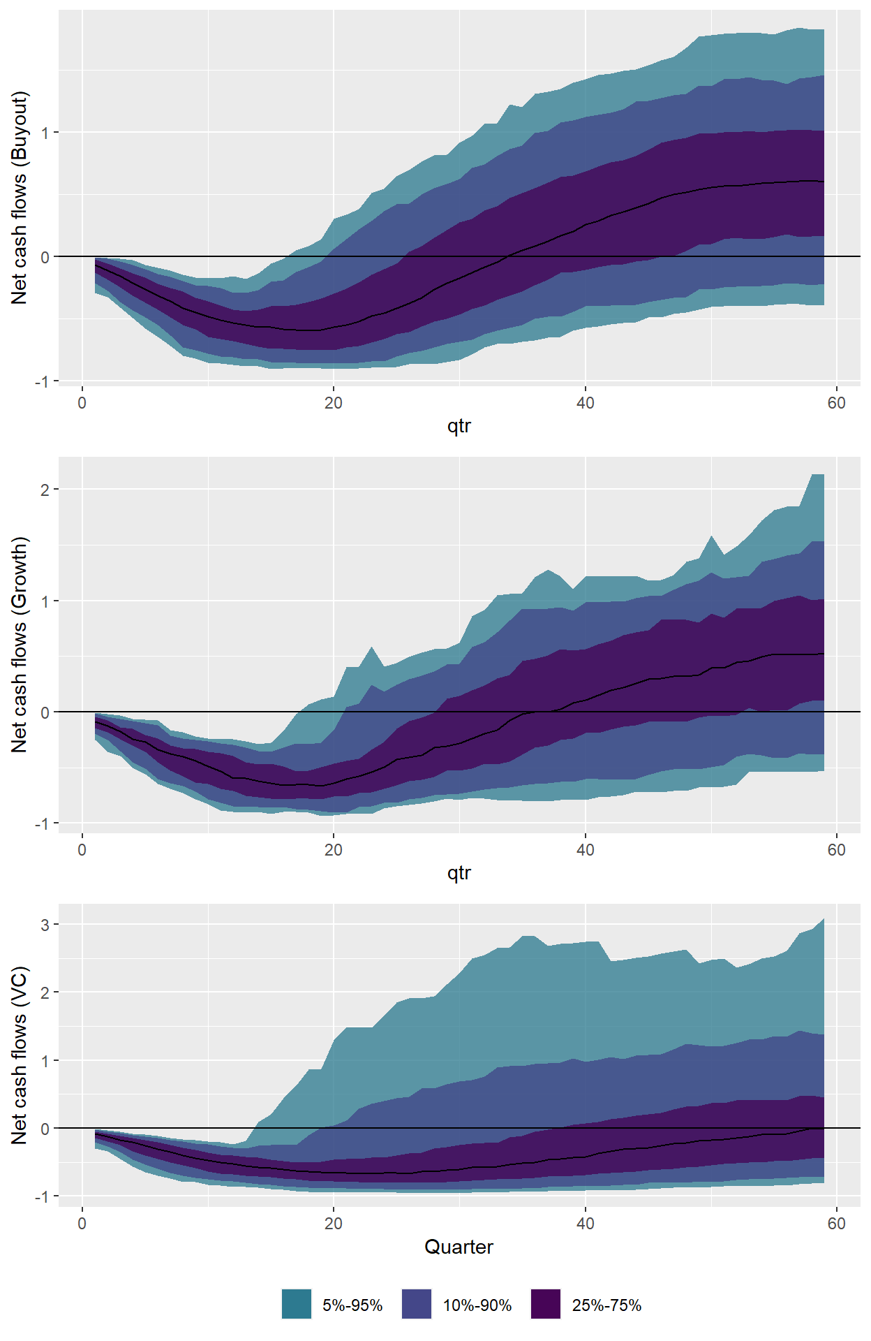
Figure 7: Dispersion of J-curves for three main strategies. Only funds with vintage year 1990 or younger considered that are at least 15 years old. Data from Preqin.
Of course, for VC funds there are two effects at work: First, it simply takes longer till liquidity events materialize. Second, a typical VC funds has a lower performance than a typical buyout or growth fund and therefore it takes longer to get to a DPI of 1x. Simple example: if it takes two funds ten years to be fully realized and one fund ends up with a final return of 1x and one with 3x, the former one will need the ten years to pay back the invested capital, while the latter one will have mostly likely returned the capital much earlier.
Public Market Equivalent (“PME”)
Last but not least, let’s get to the PMEs. This measure discounts the cash flows of a PE fund with a discount rate, often taken as a broad public market index. If it is above 1x, an investor was better off investing in the fund; if it is below 1x, he should have rather invested in the index. Conceptually, this measure is the most appealing one as it considers the opportunity costs of capital. It sounds good that you made 2x money investing in a fund, but what if you would have made 3x investing in the stock market instead?
One key question is what market indices to use. One could adjust for all sorts of factors, but to keep things simple I use broad market indices obtained from Kenneth French’s website. Later, I also use the NASDAQ index as a benchmark, as it had much stronger returns.
The table below shows that PE funds have consistently outperformed broad public stock markets. Not surprisingly, a few VC vintages ended up well below 1x, but otherwise it’s hard to find a PME starting with 0 in the table. This is in line with a large literature on PE performance that shows this outperformance.5
|
Buyout
|
Growth
|
VC
|
||||||||||
|---|---|---|---|---|---|---|---|---|---|---|---|---|
|
Vintage
|
Ratio active funds
|
Mean PME
|
Median PME
|
Mean PME (weighted by size)
|
Ratio active funds
|
Mean PME
|
Median PME
|
Mean PME (weighted by size)
|
Ratio active funds
|
Mean PME
|
Median PME
|
Mean PME (weighted by size)
|
| 1990 | 0% | 1.15 | 1.16 | 1.50 | 0% | 1.11 | 1.11 | 1.02 | 0% | 1.21 | 1.26 | 1.25 |
| 1991 | 0% | 1.27 | 1.27 | 1.63 | 0% | 1.47 | 1.47 | 1.75 | ||||
| 1992 | 0% | 0.87 | 0.77 | 1.06 | 0% | 1.47 | 1.47 | 1.47 | 0% | 1.95 | 1.74 | 2.00 |
| 1993 | 0% | 1.48 | 1.30 | 1.51 | 0% | 1.25 | 1.25 | 1.25 | 0% | 2.16 | 1.81 | 2.45 |
| 1994 | 0% | 1.41 | 1.31 | 1.45 | 0% | 1.19 | 1.19 | 1.34 | 0% | 2.25 | 1.72 | 2.29 |
| 1995 | 0% | 1.14 | 1.01 | 1.23 | 0% | 1.36 | 1.60 | 1.69 | 0% | 2.39 | 1.72 | 2.76 |
| 1996 | 0% | 1.29 | 1.50 | 1.39 | 0% | 1.42 | 1.42 | 1.33 | 5% | 2.37 | 1.28 | 2.56 |
| 1997 | 5% | 1.38 | 1.48 | 1.49 | 0% | 1.18 | 1.07 | 1.24 | 0% | 1.59 | 1.06 | 1.70 |
| 1998 | 5% | 1.36 | 1.22 | 1.34 | 0% | 1.28 | 1.15 | 1.57 | 19% | 1.62 | 1.04 | 1.60 |
| 1999 | 11% | 1.37 | 1.41 | 1.33 | 0% | 1.50 | 0.96 | 1.09 | 17% | 0.70 | 0.59 | 0.66 |
| 2000 | 15% | 1.55 | 1.51 | 1.61 | 0% | 1.17 | 1.16 | 1.19 | 19% | 0.68 | 0.65 | 0.70 |
| 2001 | 32% | 1.40 | 1.44 | 1.50 | 17% | 1.53 | 1.47 | 1.62 | 40% | 0.82 | 0.72 | 0.88 |
| 2002 | 12% | 1.34 | 1.38 | 1.46 | 33% | 0.92 | 1.02 | 0.94 | 33% | 0.68 | 0.64 | 0.78 |
| 2003 | 35% | 1.55 | 1.39 | 1.62 | 47% | 0.78 | 0.78 | 0.79 | ||||
| 2004 | 24% | 1.41 | 1.35 | 1.46 | 25% | 1.25 | 1.27 | 1.47 | 41% | 0.85 | 0.42 | 0.73 |
| 2005 | 55% | 1.24 | 1.16 | 1.39 | 17% | 1.63 | 1.43 | 1.40 | 88% | 0.97 | 0.78 | 1.05 |
| 2006 | 56% | 1.10 | 1.07 | 1.04 | 70% | 1.08 | 0.96 | 0.76 | 69% | 0.68 | 0.71 | 0.71 |
| 2007 | 80% | 1.02 | 1.04 | 1.10 | 50% | 1.07 | 1.11 | 0.90 | 93% | 1.22 | 1.11 | 1.25 |
| 2008 | 77% | 1.09 | 1.06 | 1.15 | 67% | 0.68 | 0.51 | 0.61 | 72% | 1.05 | 0.74 | 0.84 |
| 2009 | 93% | 1.16 | 1.17 | 1.20 | 80% | 0.91 | 0.76 | 1.08 | 93% | 0.93 | 0.91 | 0.90 |
| 2010 | 75% | 1.14 | 1.19 | 1.11 | 100% | 1.18 | 1.22 | 1.21 | 93% | 1.02 | 0.82 | 0.99 |
| 2011 | 100% | 1.21 | 1.24 | 1.25 | 89% | 1.42 | 1.48 | 1.35 | 95% | 1.52 | 1.19 | 1.44 |
| 2012 | 90% | 1.21 | 1.19 | 1.29 | 100% | 1.11 | 0.97 | 0.99 | 100% | 1.53 | 1.26 | 1.48 |
| 2013 | 95% | 1.32 | 1.26 | 1.33 | 100% | 0.99 | 0.92 | 1.06 | 100% | 1.23 | 1.14 | 1.32 |
| 2014 | 100% | 1.34 | 1.20 | 1.31 | 100% | 1.33 | 1.37 | 1.17 | 97% | 1.49 | 1.44 | 1.48 |
| 2015 | 100% | 1.22 | 1.14 | 1.22 | 100% | 1.19 | 1.15 | 1.17 | 100% | 1.27 | 1.15 | 1.21 |
| 2016 | 99% | 1.13 | 1.03 | 1.14 | 100% | 1.23 | 1.18 | 1.20 | 100% | 1.42 | 1.30 | 1.34 |
| 2017 | 100% | 1.16 | 1.08 | 1.24 | 100% | 1.20 | 1.15 | 1.33 | 100% | 1.27 | 1.15 | 1.25 |
| 2018 | 100% | 0.96 | 0.93 | 1.04 | 100% | 1.10 | 1.06 | 1.25 | 100% | 1.17 | 1.04 | 1.21 |
| 2019 | 100% | 0.98 | 0.89 | 1.00 | 100% | 0.99 | 1.09 | 1.02 | 100% | 1.09 | 0.94 | 1.09 |
Looking at North American funds only, we can also compare the results again with those reported by R. S. Harris, Jenkinson, and Kaplan (2014). Overall, the results are comparable. Again, we have a few outlier VC years in their sample that drive the mean higher for them, but otherwise both the level and patterns over time are similar.
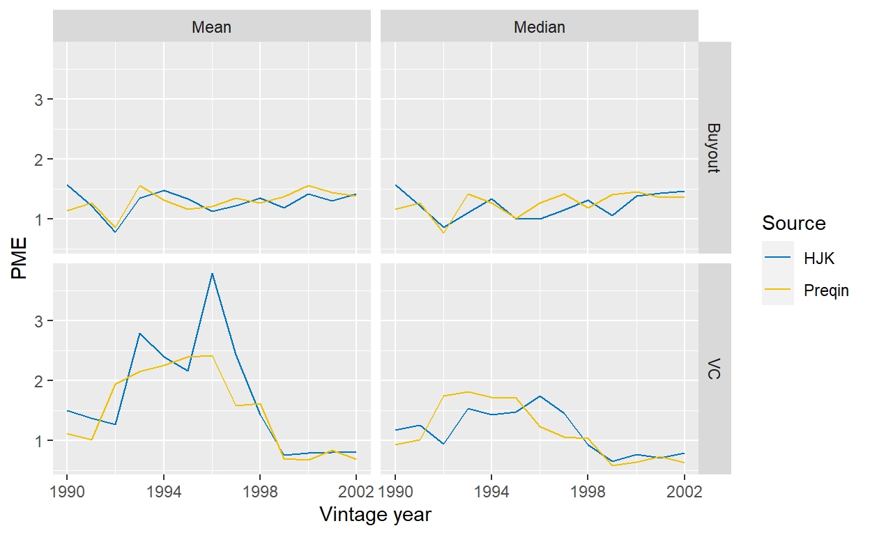
Figure 8: Comparison of PMEs from North American funds in the Preqin data set compared with Harris et al. (2014) (see Table III).
Let’s now compare the PMEs if we use the NASDAQ index instead as a comparison, which has performed substantially better than the broader stock market over the last decades. I also use this index to benchmark European funds with it, although one could of course argue how relevant such a benchmark is. The chart below shows the PMEs with the different benchmarks.
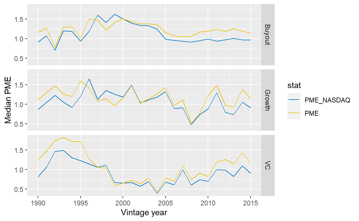
Figure 9: Median PMEs over vintage years, split across strategies. The PMEs are calculated both with a broad North American or European stock market index, taken from Kenneth French’s website, or with the NASDAQ. Funds outside North America and Europe ignored.
Changing the benchmark index to the NASDAQ reduces the vintage year median PMEs considerably for all three strategies. A typical buyout funds from 2005 to 2015 pretty much performed like the NASDAQ. Growth funds have a higher volatility, but mostly failed to beat the NASDAQ. A typical VC fund did not manage to beat the NASDAQ index. This also improves only marginally when we use the average PME instead. As explained at length above, the improvement is strongest for the VC strategy, where recent funds since 2011 have performed in line with the NASDAQ.
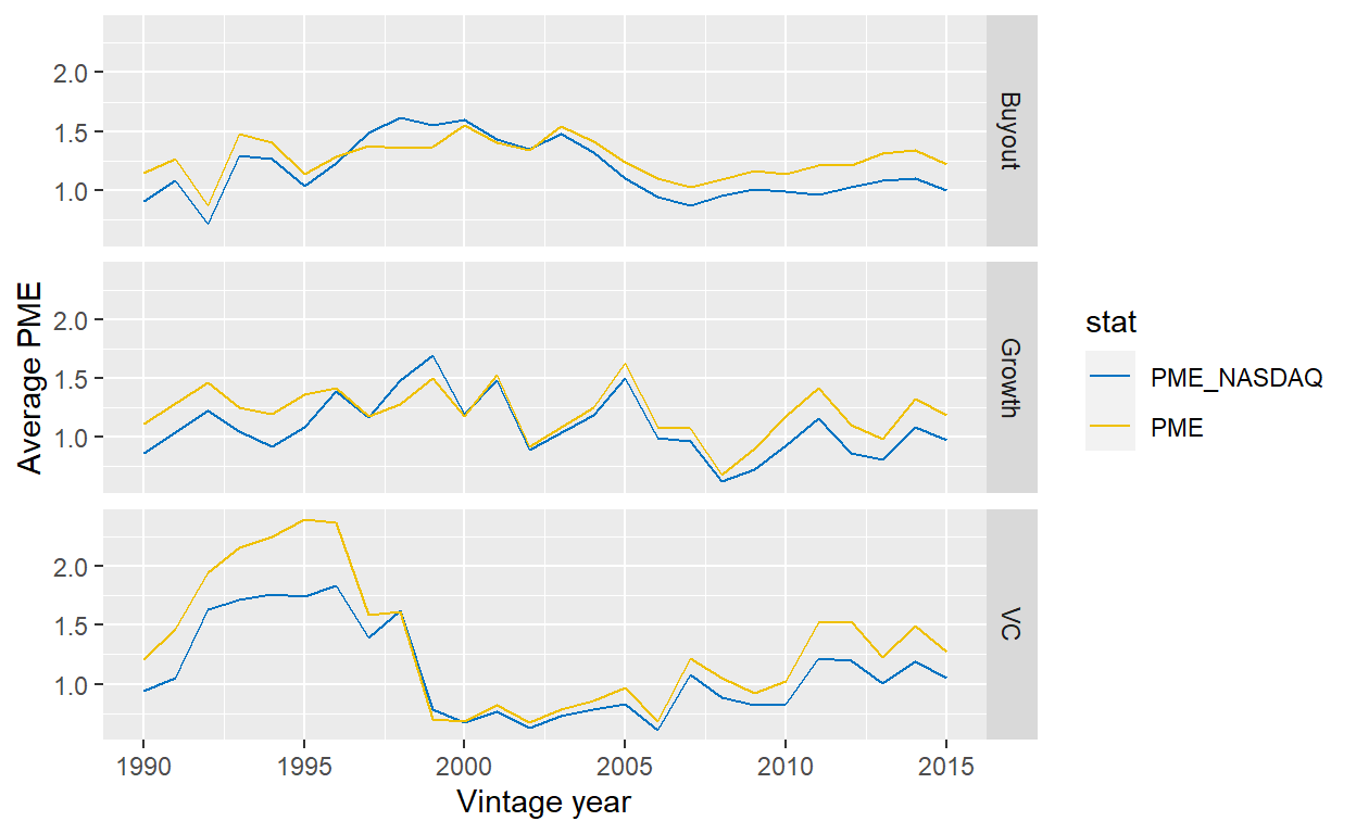
Figure 10: Average PMEs over vintage years, split across strategies. The PMEs are calculated both with a broad North American or European stock market index, taken from Kenneth French’s website, or with the NASDAQ. Funds outside North America and Europe ignored.
Summary
In this blog post, I have revisited the question of PE performance and have shown that overall this asset class continues to deliver attractive returns for its investors. The devil is in the detail though and investors should be aware at what statistic (mean, median, or something else?), vintage year composition, measure (TVPI, IRR, PME?), etc. to look at. This blog post hopefully illustrated differences arising from these choices.
I use the terms NAV and residual value interchangeably throughout this post.↩︎
In R. Harris, Jenkinson, and Stucke (2012), he and his co-authors looks further into this issue and and also shows other reasons why more than 25% of funds can claim to be top-quartile.↩︎
Of course, they had good reasons to do so when looking at their data as it was indeed very peculiar that very mature funds would report large residual values without any changes in activity. As Stucke (2011) subsequently showed, this was due to a failure of the data provider to receive updates on those funds and flag this accordingly.↩︎
For example, one could hypothesize that GPs’ likelihood to report to data providers changes over time, so instead of observing trends in the overall PE market, we are looking at a trend of GPs’ willingness to report. However, this is unlikely for two reasons. First, the trends resonate well with the overall market cycle. It just seems logical that the number of VC funds exploded in 2000, rather than GP’s just willing to report those funds. Second, the data providers use different means for data collection - Burgiss, for example, relies on LPs, not GPs.↩︎
Note that I use PE data that is aggregated on a quarterly basis. A more correct approach would be to use the unaggregated data that shows the cash flows on a daily basis. However, as my comparison with the results from R. S. Harris, Jenkinson, and Kaplan (2014) shows, it seems that this simplification has an overall negligible effect on the results.↩︎